Font Families & Grouping
Unlocking the Secrets of Typography: Exploring Font Families & Grouping
Geometric Sans
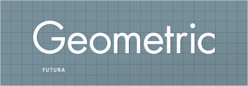
I’m actually combining three different groups here (Geometric, Realist and Grotesk), but there is enough in common between these groups that we can think of them as one entity for now. Geometric Sans-Serifs are those faces that are based on strict geometric forms. The individual letter forms of a Geometric Sans often have strokes that are all the same width and frequently evidence a kind of “less is more” minimalism in their design.
At their best, Geometric Sans are clear, objective, modern, universal; at their worst, cold, impersonal, boring. A classic Geometric Sans is like a beautifully designed airport: it’s impressive, modern and useful, but we have to think twice about whether or not we’d like to live there.
Examples of Geometric/Realist/Grotesk Sans:
Helvetica, Univers, Futura, Avant Garde, Akzidenz Grotesk, Franklin Gothic, Gotham
Humanist Sans
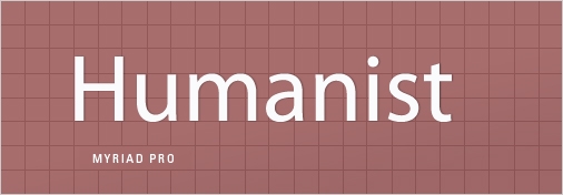
These are Sans faces that are derived from handwriting — as clean and modern as some of them may look, they still retain something inescapably human at their root. Compare the ‘t’ in the image above to the ‘t’ in ‘Geometric’ and note how much more detail and idiosyncrasy the Humanist ‘t’ has.
This is the essence of the Humanist Sans: whereas Geometric Sans are typically designed to be as simple as possible, the letter forms of a Humanist font generally have more detail, less consistency, and frequently involve thinner and thicker stoke weights — after all they come from our handwriting, which is something individuated. At their best, Humanist Sans manage to have it both ways: modern yet human, clear yet empathetic. At their worst, they seem wishy-washy and fake, the hand servants of corporate insincerity.
Examples of Humanist Sans:
Gill Sans, Frutiger, Myriad, Optima, Verdana
Old Style
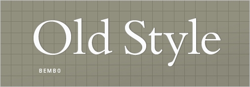
Also referred to as ‘Venetian’, these are our oldest typefaces, the result of centuries of incremental development of our calligraphic forms. Old Style faces are marked by little contrast between thick and thin (as the technical restrictions of the time didn’t allow for it), and the curved letter forms tend to tilt to the left (just as calligraphy tilts). Old Style faces at their best are classic, traditional, readable and at their worst are… well, classic and traditional.
Examples of Old Style:
Jenson, Bembo, Palatino, Garamond
Garamond was considered so perfect at the time of its creation that no one really tried much to improve on it for a century and a half.
Transitional and Modern
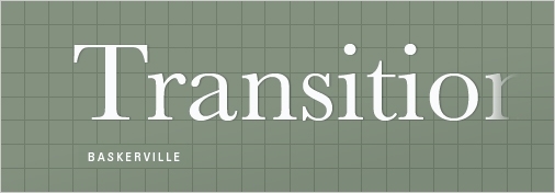
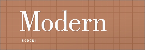
An outgrowth of Enlightenment thinking, Transitional (mid 18th Century) and Modern (late 18th century, not to be confused with mid 20th century modernism) typefaces emerged as type designers experimented with making their letterforms more geometric, sharp and virtuosic than the unassuming faces of the Old Style period. Transitional faces marked a modest advancement in this direction — although Baskerville, a quintessential Transitional typeface, appeared so sharp to onlookers that people believed it could hurt one’s vision to look at it.
In carving Modernist punches, type designers indulged in a kind of virtuosic demonstration of contrasting thick and thin strokes — much of the development was spurred by a competition between two rival designers who cut similar faces, Bodoni and Didot. At their best, transitional and modern faces seem strong, stylish, dynamic. At their worst, they seem neither here nor there — too conspicuous and baroque to be classic, too stodgy to be truly modern.
Examples of transitional typefaces:
Times New Roman, Baskerville
Examples of Modern serifs:
Bodoni, Didot
Slab Serif
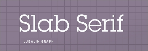
Also known as ‘Egyptian’ (don’t ask), the Slab Serif is a wild card that has come strongly back into vogue in recent years. Slab Serifs usually have strokes like those of sans faces (that is, simple forms with relatively little contrast between thick and thin) but with solid, rectangular shoes stuck on the end. Slab Serifs are an outlier in the sense that they convey very specific — and yet often quite contradictory — associations: sometimes the thinker, sometimes the tough guy; sometimes the bully, sometimes the nerd; sometimes the urban sophisticate, sometimes the cowboy.
They can convey a sense of authority, in the case of heavy versions like Rockwell, but they can also be quite friendly, as in the recent favorite Archer. Many slab serifs seem to express an urban character (such as Rockwell, Courier and Lubalin), but when applied in a different context (especially Clarendon) they strongly recall the American Frontier and the kind of rural, vernacular signage that appears in photos from this period. Slab Serifs are hard to generalize about as a group, but their distinctive blocky serifs function something like a pair of horn-rimmed glasses: they add a distinctive wrinkle to anything, but can easily become overly conspicuous in the wrong surroundings.
Examples of Slab Serifs:
Clarendon, Rockwell, Courier, Lubalin Graph, Archer
Last updated